EDA of Data
EDA was created for each data set after cleaning as seen below.
EDA of Salary Data
GGplot was used in R to visualize relationship between Maximum Salary and Estimated Earnings and Signing Bonus and Estimated Earnings as seen below.
Graphs
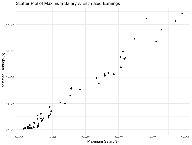
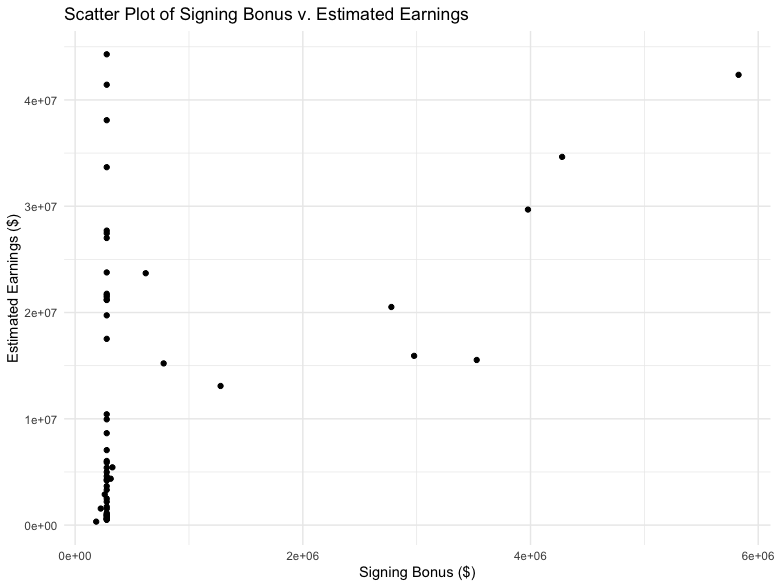
These graphs show that there is a positive correlation between Maximum Salary and Estimated Earnings and little to no correlation between Signing Bonus and Etimated Earnings.
Code


EDA of Biographical Data
GGplot was used in R to visualize relationship between Player Weight and Player Age, Player Height and Position, and Player Position and Birth Date as seen below.
Graphs
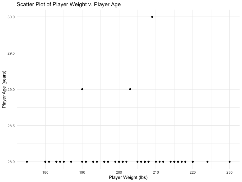
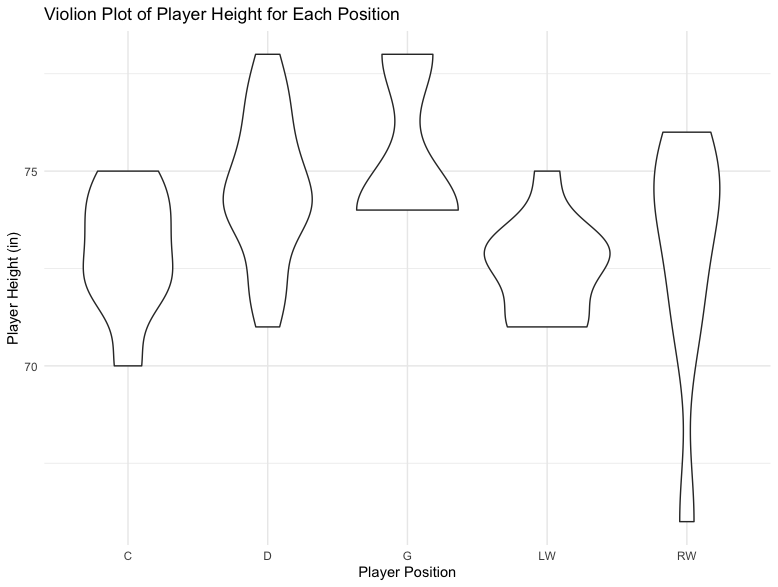
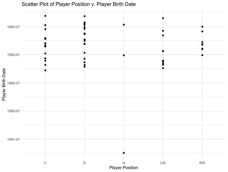
These graphs show that there are a wide range of weights for each age, Defensemen and Goalies are larger than other positions, and BirthDates might be squewed towards earlier in the year then later.
Code


EDA of Game Stats
GGplot was used in R to visualize relationship between Average Games and Goals, Average Games and Assists, and Average Assists and Goals as seen below.
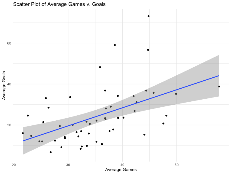
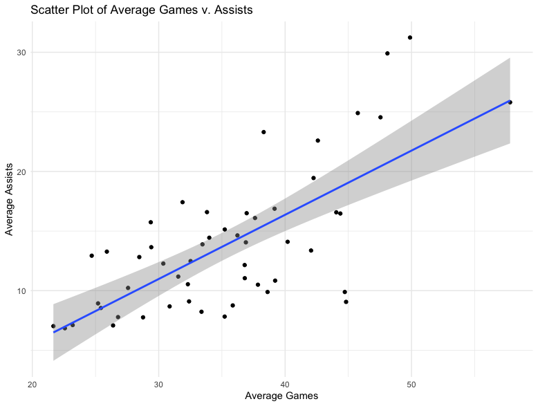
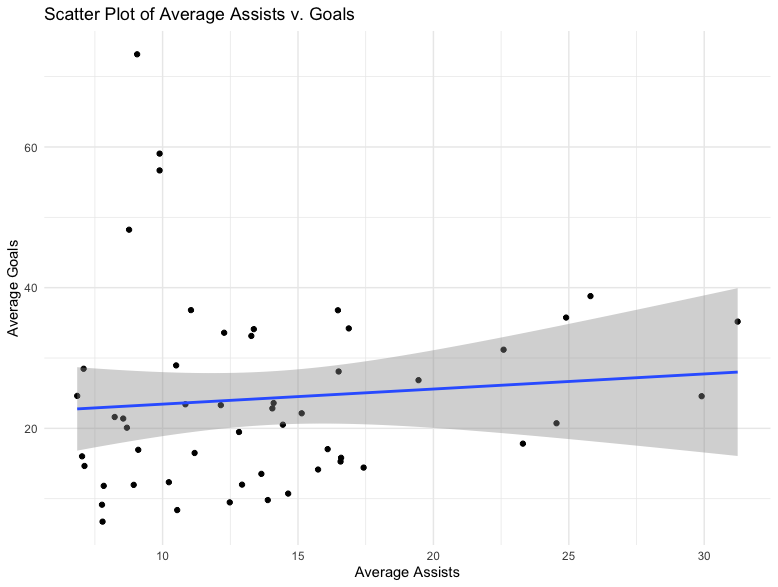
These graphs show that there is a postive trend between Average Games and Goals and Average Games and Assists. However, there does not appear to be a trend between Assists and Goals.
Code


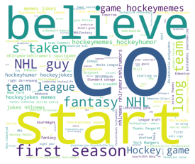
EDA of Twitter Data
A Word Cloud was created using python.
Word Cloud
Code
